CSS Outline - Something Out of the Box Model
CSS Outline
CSS outline is a line that is drawn around the HTML element just outside of the border to make the element stand out.
The CSS outline looks just like the border, but it is drawn outside of the border. The outline is not part element's box model but the border is part of the element's box model.
CSS outlines are generally used to create focus on certain areas like buttons, forms, links, etc.
Example of CSS outline:
Example
▶ Try it# Syntax
The order of the properties is not important. You can use any of the three properties in any order.
The other 2 properties width and color are optional but you have to mention the type or style of the outline every time you use them.
Example
▶ Try itCSS Outline Property
The CSS outline has the following properties:
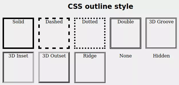
1. CSS Outline Style
The outline-style property sets the style of an element's outline. The default outline-style is none.
The outline-style can have one following values:
- solid - It defines a solid outline.
- dashed - It defines a dashed outline.
- dotted - It defines a dotted outline.
- double - It defines a double outline.
- groove - It defines a 3D grooved outline.
- inset - It defines a 3D inset outline.
- outset - It defines the 3D outset outline.
- ridged - It defines a 3D ridged outline.
- none - It defines no outline.
Example
▶ Try it2. CSS Outline Color
The outline-color property sets the color to outline. The color can be set by any method like color name, HEX value, RGB value, HSL value, etc.
The default color of the outline is the same as the text color.
Example
▶ Try it3. CSS Outline width
The outline-width property sets the thickness of the element's outline. outline-width has the following values:
- thin - It defines an outline of generally 1px.
- medium - It defines an outline of generally 3px.
- thick - It defines an outline of generally 5px.
- Any width - It defines an outline in px, pt, cm, etc.
Example
▶ Try it4. CSS Outline offset
The outline-offset property sets a gap between the border and outline. outline-offset value can be given in any valid unit. The default outline-offset value is 0.
Example
▶ Try it5. CSS Outline shorthand property
The outline is a shorthand property for all CSS outline properties, which is used to set multiple outline property values in a single line.
Using outline property we can specify one, two, or all three values of outline property, where outline-style is the required property, outline-width and outline-color are optional properties. The order of these three doesn't matter.
Example
▶ Try itDifference Between Border And Outline
The outline looks very similar to the border both are different from each other.
The difference between outline and border are as follows:
| CSS outline | CSS border |
|---|---|
| The outline doesn't take up space and can overlap with other elements nearby | Borders do take space and do not overlap with another element |
| Outline do not change shape and size of element | Border change the shape and size of the element |
| Outline can't be given different values to its different edges, it's the same in all directions | Borders can be given different values to the different sides of the border |
| Outline can't have another shape than a rectangle | Borders can have any shape between square and circle |
| The outline does not have an impact on surrounding elements | Borders have an impact on surrounding elements |
CSS Text Outline
The text outline is a technique to draw a line around the text. It can be used to indicate some special text or to highlight some text.
The text-stroke property sets the outline of the text. It can be used to highlight text or to indicate some special text.
The property that sets text outline is under experiment and is only supported by the browsers that extend support to 'webKit'. So the syntax also uses the prefix of WebKit. The property is -webkit-text-stroke.
# Syntax
Example
▶ Try itConclusion
If you want to give an HTML element an effect of the border without changing the shape of the element, then use the outline property. The outline is not the part of element's box-model hence it does not even interact with surrounding elements.
To give an outline to texts you can use -webkit-text-stroke property.
Frequently Asked Questions
What is outline?
The outline is a rectangular line that is drawn around an element outside the border. It does not change the shape of the element.
How do I make an outline in CSS?
To make an outline in CSS, you can use the outline property. The syntax is outline: style width color.
What is the use of outline in CSS?
The outline is used to give an effect of the border without changing the shape of the element.
What is CSS outline-color?
The outline-color property sets the color of an outline.
Overflow in CSS
On a web page, we can have a lot of content. Sometimes, the content may be more than the size of the container. In such cases, the content will overflow the container.
The content that overflows the container is hidden by default. We can change this behavior using the overflow property.
CSS overflow values
| Value | Description |
|---|---|
| visible | Default value. Content is not clipped, it may be rendered outside the element's box. |
| hidden | Content is clipped and no scrollbars are provided. |
| scroll | Content is clipped and scrollbars are provided. |
| auto | It also provides a scroll bar like the above property but in this scroll bar is provided only when it's necessary. |
1. Overflow visible
By default, the overflow property is set to visible. This means that the content is not clipped, it may be rendered outside the element's box.
Example
▶ Try itOutput:
Overflow hidden
When the overflow property is set to hidden, the content is clipped and no scrollbars are provided.
Example
▶ Try itOutput:
Overflow scroll
The overflow scroll value clips the content but extra content is visible by a scroll bar that is generated.
The scroll bar can be horizontal or vertical.
Example
▶ Try itOutput:
Overflow auto
If the overflow is clipped then auto value creates a scroll to make overflowed content visible.
The scroll bar created by auto can be horizontal or vertical.
Example
▶ Try itOutput:
Overflow x and y
The overflow-x and overflow-y properties let us control the overflow of content in the x and y directions separately.
To control the overflow of content in the x direction, we use the overflow-x property.
To control the overflow of content in the y direction, we use the overflow-y property.
Example
▶ Try itDifferent Types of Cursors in CSS
CSS cursor property is used to change the cursor type when the mouse pointer is over an element. Cursors are used to specify possible actions that can be performed on an element.
For example when you hover over a link, the cursor changes to a hand. This is because the cursor property is set to pointer.
| Default property: | auto |
| Version: | CSS 2,3 |
| Animation: | no |
| Applies to: | all element |
| Inherited: | Yes |
Different Types of Cursor Values
There are many different types of cursor values. Take your mouse pointer over these buttons and see how the pointer changes.
Following table shows the cursor property values and their corresponding cursors.
| Value | Cursor (hover your mouse on buttons below) |
|---|---|
| auto | auto |
| default | default |
| none | none |
| initial | initial |
| inherit | inherit |
| context-menu | context-menu |
| help | help |
| pointer | pointer |
| progress | Progress |
| wait | wait |
| cell | cell |
| crosshair | crosshair |
| text | text |
| vertical-text | vertical-text |
| alias | alias |
| copy | copy |
| move | move |
| no-drop | no-drop |
| not-allowed | not-allowed |
| all-scroll | all-scroll |
| col-resize | col-resize |
| row-resize | row-resize |
| n-resize | n-resize |
| e-resize | e-resize |
| s-resize | s-resize |
| w-resize | w-resize |
| ne-resize | ne-resize |
| nw-resize | nw-resize |
| se-resize | se-resize |
| sw-resize | sw-resize |
| ew-resize | ew-resize |
| ns-resize | ns-resize |
| nesw-resize | nesw-resize |
| nwse-resize | nwse-resize |
| zoom-in | zoom-in |
| zoom-out | zoom-out |
| grab | grab |
| grabbing | grabbing |
Here is an example:
Example
▶ Try itPosition in CSS
Position property in CSS is used to specify the type of positioning method used for an element.
Type of positioning means how the element is positioned in the document flow. Suppose we have a div element and we want to position it at the bottom right corner of the page or we want to show it on the top of the page. We can do this by using position property.
Types of Positioning
There are five different types of positioning methods for elements:
- static - Default value. Elements render in order, as they appear in the document flow.
- relative - Relative positioning moves an element in relation to its normal position.
- absolute - Absolute positioning positions the element relative to the nearest positioned ancestor (instead of positioned relative to the viewport, like fixed).
- fixed - Fixed positioning is a type of absolute positioning that positions the element relative to the viewport, which means it always stays in the same place even if the page is scrolled.
- sticky - Sticky positioning is a hybrid of relative and fixed positioning. The element is treated as relative positioned until it crosses a specified threshold, at which point it is treated as fixed positioned.
Other content
Other content
Other content
Other content
Other content
Other content
1. Position static
Static positioning is the default value of the position property. Static positioning means that the element is not positioned in any special way; it is always positioned according to the normal flow of the page.
Static positioning is not a real positioning method. It is just the default value of the position property. Static positioning is used to remove the effect of any previous positioning method.
The element positioned static is not affected by top, bottom, left, and right properties.
Example
▶ Try it2. Position relative
Position relative value sets the element relative to its normal value.
The position relative is followed by offsets either top, bottom, left, or right. These offsets are used to move the element from its normal position.
Example
▶ Try it3. Position fixed
Position fixed value is used to set an element fixed to the page at any spot. Regardless of the page scroll, it doesn't move the element is fixed to its position.
The top, bottom, left or right property is used to set the element where it should be located.
Example
▶ Try it4. Position absolute
The position absolute value is used to set the positioning of the element according to the nearest positioned parent. In case none of its parents is positioned then the element will position itself according to the document body.
The top, bottom, left or right property is used to set the element where it should be located.
Note - The parent is called positioned only when it has any position value other than static.
Example
▶ Try it5. Position sticky
Position sticky value is used to make an element fix or stick at any location. Beyond that location, the element is free to move or scroll.
Position sticky value toggle between relative and fixed. This property is generally used to stick any element or note at the top of a web page.
Note - This property needs at least one value among the top, bottom, left, and right.
Example
▶ Try itLearn the difference between relative and absolute positioning in CSS.
CSS Display Property
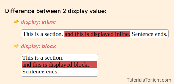
CSS display property defines how an HTML element is displayed on the webpage.
If it is displayed as a block then it takes the full width of the webpage. If it is displayed as inline then it takes space equal to the width of the content.
Look at the image below to understand.
The CSS display property is used to specify the type of box used for an element.
Defining a display type not only affects the element itself but also its child elements.
Apart from the block and inline, there are many other values of the display property. We will see them below.
CSS Display Property Values
There are mainly 6 values of CSS display property.
- block - The element is displayed as a block element. It starts on a new line and takes up the whole width.
- inline - The element is displayed as an inline element. It does not start on a new line. It only takes up as much width as necessary.
- inline-block - The element is displayed as an inline-level block container. The element itself is formatted as an inline element, but you can apply height and width values.
- none - The element is completely removed. It will not be displayed, and it will not take up any space.
- flex - The element is displayed as a block-level flex container.
- grid - The element is displayed as a block-level grid container.
Let's look at these values in detail.
1. Display block
The block value displays the elements as a block. It breaks the line at the start and end of the element and covers the whole width of the container.
The elements having block as a default value are:
- div - division tag
- h1 - heading tag
- p - paragraph tag
- ul - unordered list tag
Example
▶ Try it2. Display inline
The inline value displays the element within the line. It does not change lines or take any extra space.
When an element is displayed as inline, it takes only the width of the content. It does not support height and width properties.
Every HTML element has some default display value. Here are the elements that have inline as a default value:
- a - anchor tag
- b - bold tag
- i - italic tag
- span - span tag
Example
▶ Try it3. Display inline-block
The inline-block value displays the element as an inline element, but you can apply height and width values.
It does not break the line and takes only width of the content. But it supports height and width properties.
The elements having inline-block as a default value are :
- img - image tag
- input - input tag
- button - button tag
Example
▶ Try it4. Display none
The none value removes the element from the document flow. It will not be displayed, and it will not take up any space.
Example
▶ Try it5. Display flex
The flex value displays the element as a block-level flex container. It is used to create flexbox layouts.
Flexbox is a layout mode in CSS3. It is a one-dimensional layout mode. It can arrange the elements in a row or column, but not both.
Example
▶ Try itConclusion
Understanding the display property is very important for a web developer. It helps us to create a better layout for our web pages.
Practice the examples given in this tutorial to understand the display property better.
CSS Shadow Effect
CSS Shadow is used to add a shadow effect to the HTML elements.
There are two types of shadows in CSS:
- Box Shadow
- Text Shadow
1. CSS box shadow
The box-shadow property is used to create shadow for the HTML elements.
The box-shadow creates a shadow around the element outside the element's border.
Syntax:
Here is the explanation of the values:
| Value | Description |
|---|---|
| h-shadow | Required. The horizontal shadow position. Negative values are allowed. |
| v-shadow | Required. The vertical shadow position. Negative values are allowed. |
| blur | Optional. The blur distance. Negative values are not allowed. |
| spread | Optional. The shadow size. Negative values are not allowed. |
| color | Optional. The shadow color. The default is black. |
| inset | Optional. The shadow is inside the border. |
Let's see some examples:
Example
▶ Try it1.1 Multiple box shadow
You can add multiple box shadows to an element by separating the values with a comma.
There is no limit to the number of box shadows you can add to an element.
Just by using box-shadow correctly, you can create some amazing effects.
Let's see some examples:
Example
▶ Try it2. CSS text shadow
The text-shadow property is used to add a shadow effect to the text.
Using text-shadow property you can add horizontal or vertical shadow with different color and blur radius.
It is similar to box-shadow property but it is used to add shadow to text.
Syntax
The syntax of text-shadow property is given below:
Here, horizontal and vertical are the horizontal and vertical offset of the shadow and blur is the blur radius of the shadow.
i. Simple text shadow
Example
▶ Try itOutput:
This paragraph has shadow property.
ii. Text shadow with different color
Example
▶ Try itOutput:
This paragraph has blue shadow.
iii. Text shadow with different color and blur-radius
Example
▶ Try itOutput:
This paragraph has blue shadow with blur-radius 5px.
iv. Multiple shadow
Example
▶ Try itOutput:
This paragraph has multiple shadow.
CSS Float Property
The CSS float property is used to place an element on the left or right side of its container, and allow text and inline elements to wrap around it.
Once an element is floated, it is removed from the normal flow of the page, and other elements will flow around it.
It is used to push HTML elements or containers left or right or to create a text wrapping effect around an image.
Float Property Values
You can set the float property to one of the following values:
| Value | Description |
|---|---|
| left | Floats the element to the left side of its container. |
| right | Floats the element to the right side of its container. |
| none | Default value. The element does not float. |
| inherit | Specifies that the value of the float property should be inherited from the parent element. |
| inline-start | Floats the element to the left side of its container in left-to-right text, or to the right side in right-to-left text. |
| inline-end | Floats the element to the right side of its container in left-to-right text, or to the left side in right-to-left text. |
CSS float left
The float property with the value left is used to float an element to the left side of its container.
The element having property float: left is pushed left to the container or to the nearest floated element.
Example
▶ Try itCSS float right
The element having property float:right; is pushed right to the container or to the nearest floated element.
Example
▶ Try itNote: The default value of the float property is none to keep the element in the normal flow of the page.
CSS clear property
The clear property is used to specify whether an element can be next to floating elements that precede it or must be moved down (cleared) below them.
It is used to control the element which will float beside the floating element.
If we specify value clear: left then no floating element will be allowed to the left side of the element.
If we specify value clear: right then no floating element will be allowed to the right side of the element.
Example
▶ Try itCSS Text Align
CSS provides a property called text-align which is used to align the text in a block element. It can be used to align the text on the left, right, center, or justify.
The text-align has the following values:
- left - It aligns the text to the left of the container. It is the default value.
- right - It aligns the text to the right of the container.
- center - It aligns the text to the center of the container.
- justify - When the text-align property is set to justify, the text is aligned to both the left and right margins. The text is stretched to fill the entire line.
- start - It aligns the text from the start of the container. When the direction: rtl then starting position is right so it will start from the right side and will look as if it's right aligned.
- end - It aligns the text from the ending of the container. When the direction: rtl then the ending position is left so it will end at the left side and will look as if it's left aligned.
- inherit - It inherits the text-align value from its parent element.
Let's see the example of the text-align property.
Example of text-align
We have a div element and inside it we have a p element. Let's test the text-align property on it.
text-align: left
By default, the text-align property is set to left. So, the text will be aligned to the left of the container.
Example
▶ Try itOutput:
The text is aligned to the left of the container.
text-align: right
When the text-align property is set to right, the text is aligned to the right of the container.
Example
▶ Try itOutput:
The text is aligned to the right of the container.
text-align: center
When the text-align property is set to center, the text is aligned to the center of the container.
Example
▶ Try itOutput:
The text is aligned to the center of the container.
text-align: justify
The text is stretched to fill the entire line. When the text-align property is set to justify, the text is aligned to both the left and right margins.
Example
▶ Try itOutput:
The text is stretched to fill the entire line.
text-align: start
When the text-align property is set to start, the text is aligned from the start of the container. When the direction: rtl then starting position is right so it will start from the right side.
Example
▶ Try itOutput:
The text is aligned from the start (left-to-right).
The text is aligned from the start (right-to-left).
text-align: end
When the text-align property is set to end, the text is aligned from the ending of the container. When the direction: rtl then the ending position is left so it will end on the left side.
Example
▶ Try itOutput:
The text is aligned from the ending (left-to-right).
The text is aligned from the ending (right-to-left).
Also, learn how to center div elements and how to center images.
Using icons with CSS
Icons are used to add visual representation to the text. They are used to make the text more attractive and appealing. Icons are used in many websites to make the website more attractive and user-friendly.
The icon is a comprehensible symbol that is used to display something in the form of a sign or symbol on the computer screen.
Icons are available in many formats like SVG, PNG, JPG, etc. In this section, we will learn how to use icons in our website using CSS.
Here are some examples of icons:
How to add icons
To add icons to the webpage you need to use the icon library.
These icon libraries create icons using CSS so that users can add other CSS properties to it too like color, shadow, size, etc.
These icons are embedded in webpage by using HTML tags like <i> or <span> tag with class attribute.
Here are some examples of icon libraries that you can use:
1. Font awesome icons
Font Awesome is a free icon library that is used to add icons to the website. It is a very popular icon library that is used by many developers.
To use font-awesome icons you first need to add the font-awesome library to your website using CDN.
Note: You can also download the font-awesome library and add it to your website.
Every icon in the font-awesome library has a unique class name which is used to add that icon to the webpage.
For example, to add the home icon to the webpage you need to use the fa-home class.
You need to check the icon library to know the class name of the icon you want to add.
Example
▶ Try it2. Google icons
To use google icons you first need to add the google icons library to your website using CDN.
Visit the google icons website and click on the icon you want to add to the webpage. You will see the HTML code that you need to add to the webpage to add that icon.
Example
▶ Try it3. Bootstrap icons
To use bootstrap icons you first need to add the bootstrap icons library to your website using CDN.
Then use the appropriate class name to add the icon to the webpage.
Here is an example of how to add bootstrap icons to the webpage.
Example
▶ Try itStyling Buttons in CSS
Buttons are the most important element of any website. They are used to perform an action. Buttons are used to submit a form, to open a modal, to open a link, to perform a function, etc. Buttons are used in almost every website. So, it is important to style them properly.
To create buttons we use the <button> tag. Sometimes we also use the <a> tag is used to create buttons for hyperlinks.
Let's look at 10 different types of buttons that we can create using CSS. But first, we will learn to add basic styling to buttons.
Basic Styles for Buttons
Let's look at some basic styles that we can apply to buttons.
- border - Sets the border of the button.
- padding - It helps to give the correct size to the button.
- background-color - Sets the background color of the button.
- color - Sets the color of the text inside the button.
- box-shadow - It helps to give a shadow effect to the button.
- font-size - Sets the font size of the text inside the button.
- border-radius - It helps to give rounded corners to the button.
- cursor - It helps to change the cursor when it is over the button.
- hover - It helps to change the style of the button when the cursor is over the button. It is also called pseudo-class.
Let's now create some beautiful buttons with CSS!
List of 10 CSS Buttons
Here is a list of 10 CSS buttons that you can use in your projects. You can also use these buttons to create your own buttons.
1. Simple Button
Here is a simple button with a simple CSS code.
Example 1
▶ Try itOutput:
2. Rounded Button
Use the border-radius property to create a rounded button. Here is a rounded button with a simple CSS code.
Example 2
▶ Try itOutput:
3. Button with Shadow
Use the box-shadow property to create a button with shadow. Box shadow takes values for offset-x, offset-y, blur-radius, spread-radius and color.
Example 3
▶ Try itOutput:
4. Button with Border
Use the border property to create a button with a border. the border takes values for width, style, and color.
Example 4
▶ Try itOutput:
5. Button with Gradient
Use the background property to create a button with a gradient.
Use the linear-gradient function to create a linear gradient.
Example 5
▶ Try itOutput:
6. Button with hover effect
Use the :hover pseudo-class to create a button with hover effect.
Example 6
▶ Try itOutput:
7. Capsule Shaped Button
Round the corners of a button to create a capsule shaped button.
Example 7
▶ Try itOutput:
8. Button shadow hover animation
The following button has a shadow animation when the mouse pointer hovers over it.
Example 8
▶ Try itOutput:
9. Button with shake animation
The following button has a shake animation when the mouse pointer hovers over it.
Example 9
▶ Try itOutput:
10. Button skew on hover
The following button has a skew animation when the mouse pointer hovers over it.
Example 10
▶ Try itOutput:
CSS COMBINATORS
CSS combinators are a combination of two or more other CSS selectors and create a relationship between them. The combinators also provide the location of the content in the HTML document and are used to target specific elements to style.
There are many different types of combinator selectors in CSS. Here are 8 most used of them:
- Descendant selector
- Adjacent sibling selector (+)
- General sibling selector (~)
- Child selector
- First child selector ( :first-child )
- Last child selector ( :last-child )
- Only child selector ( :only-child )
- Nth child selector ( :nth-child() )
1. Descendant selector
The descendant selector is used to select all the elements that are descendants of a specified element.
A descendant combinator is written by a combination of two or more selectors separated by a space. The first selector is the parent element and the second selector is the child element.
For example, div ul li will select all the li elements that are descendants of ul elements that are descendants of div elements.
Example
▶ Try it2. Adjacent sibling
The adjacent selector selects the elements that are adjacent to the specified selector. Here adjacent means immediately after the specified selector.
This combinator is written by a combination of other selectors separated by a plus (+).
For example, h2 + p will select all the p elements that are immediately after by h2 elements.
Example
▶ Try it3. General sibling selector
The general sibling selector selects all the sibling elements that follow the first selector element.
This combinator is written by a combination of other selectors separated by a tilde (~).
For example div ~ p will select all the p elements that are siblings of div elements.
Example
▶ Try it4. Child selector
The child selector selects all the elements that are the child of the specified selector. Here adjacent means immediately after the specified selector.
This combinator is written by a combination of other selectors separated by greater than (>).
For example div > p will select all the p elements that are the child of div elements.
Example
▶ Try it5. First child selector
The first child selector selects all the elements that are the first child of the specified selector.
It is written as :first-child.
For example div :first-child will select all the first child elements of div elements.
Example
▶ Try it6. Last child selector
The last child selector selects all the elements that are the last child of the specified selector.
It is written as :last-child.
For example div :last-child will select all the last child elements of div elements.
Example
▶ Try it7. Only child selector
The only child selector selects all the elements that are the only child of the specified selector.
It is written as :only-child.
For example div :only-child will select all the only child elements of div elements. If there are more than one child element then it will not select any element.
Example
▶ Try it8. Nth child selector
The nth-child selector selects all the elements that are the nth child of the specified selector.
It is written as :nth-child().
For example div :nth-child(2) will select all the second child elements of div elements.
Example
▶ Try itCSS Specificity
CSS specificity is a set of rules that determines which CSS property values are applied to an element. It is used to resolve conflicts when more than one rule applies to a particular element. It is a way to determine which style declaration has the highest priority.
Specificity is based on the matching rules of CSS selectors. The more specific selector is the higher its priority. The browser applies the CSS rule with the highest priority.
If you have trouble understanding the above definition, let's take an example.
Let's say we have a p element with a class .represent and an id #represent. We have two CSS rules for this element.
Now, what color will be applied to the p element? The answer is red. Because the id selector has a higher specificity than the class selector.
CSS selectors are provided with different values, ID has higher value than class. If multiple CSS rules are pointing to the same element then on the basis of those selector values CSS rules are ranked.
CSS Specificity Rules
On the basis of different selectors specificity value is given as follows:
- inline style - Inline style has the highest value of specificity among other selectors. It is 1000 and can be represented as (1, 0, 0, 0)
- id - ID has the second highest specificity value. It is 100 and can be represented as (0, 1, 0, 0)
- class, pseudo-class, attribute selector - These have the third highest value of specificity among other selectors. It is 10. Can be represented as (0, 0, 1, 0)
- element or pseudo-element - These have the lowest specificity value. It is 1 and can be represented as (0, 0, 0, 1)
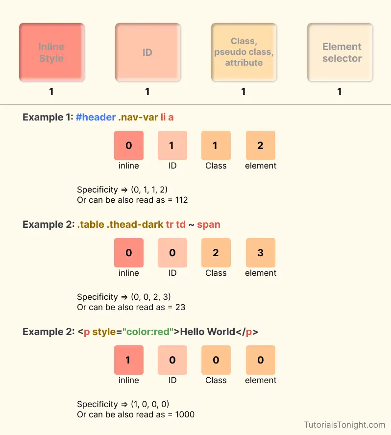
Calculation of specificity
To calculate the specificity of a CSS selector, we need to add the values of each selector type. For example, if we have a selector #id.class, then the specificity value will be (0, 1, 1, 0) because it has one id selector and one class selector. It can also be represented as 0110.
Let's take another example. If we have a selector p.class, then the specificity value will be (0, 0, 1, 1). It can also be represented as 0011.
Example 1:
Example
▶ Try itHere in the above example, both CSS rules are pointing to the same element. But the CSS rule with class selector has a higher specificity value than the CSS rule with element selector. So, the color of the p element will be blue.
# Example 2
Example
▶ Try itHere in the above example, both CSS rules are pointing to the same element. But the CSS rule with an ID selector has a higher specificity value than the CSS rule with a class selector. So, the color of the p element will be red.
Example 3:
Example
▶ Try itInline CSS has the highest specificity value. So, the color of the p element will be red.
Equal specificity
When there are two CSS rules having the same specificity value then the rule that is defined lower in the style sheet is applied.
Example
▶ Try itWhat is the specificity in CSS?
Specificity is a value that is used to determine which CSS rule will be applied to an element. It is calculated by adding the values of each selector type. The selector with a higher specificity value will be applied.
Why use specificity in CSS?
When there are two or more than 2 CSS rule set for the same element, the browser gets confused about which CSS rule to apply. So, it uses specificity to determine which CSS rule to apply.
What has the highest specificity in CSS?
Inline CSS has the highest specificity value. It is 1000.
What is the lowest specificity in CSS?
Element selector has the lowest specificity value. It is 1.
What is the order of specificity in CSS?
Inline CSS > ID selector > Class selector > Element selector
What is the specificity value of universal selector?
Universal selector (*) has a specificity value of 0.
CSS transform Property - 2D and 3D
Introduction
The transform property is used to transform an element in 2D or 3D space. It allows you to rotate, scale, skew, or translate an element. This property accepts a CSS function or a list of functions.
This property visually transforms an element without changing its layout. It can be used to create animations, icons, and other visual effects.
Syntax
The syntax of the transform property is given below:
The transform property accepts the following values:
- none - This value specifies that no transformation should be applied.
- transform-functions - This value specifies a list of one or more transformation functions.
CSS transform Functions
You can see in the above syntax that the transform property accepts a list of one or more transformation functions. Let's see the list of transformation functions with their use with examples.
2D transform Functions
translate() - This function is used to translate an element along the X and Y axis.
- translateX()
- translateY()
- translateZ()
scale() - This function is used to scale an element along the X and Y axis.
- scaleX()
- scaleY()
- scaleZ()
rotate() - This function is used to rotate an element along the X and Y axis.
- rotateX()
- rotateY()
- rotateZ()
skew() - This function is used to skew an element along the X and Y axis.
- skewX()
- skewY()
matrix() - This function is used to apply a 2D transformation to an element.
3D transform Functions
translate3d() - This function is used to translate an element along the X, Y, and Z axis.
scale3d() - This function is used to scale an element along the X, Y, and Z axis.
rotate3d() - This function is used to rotate an element along the X, Y, and Z axis.
matrix3d() - This function is used to apply a 3D transformation to an element.
perspective() - This function is used to define the perspective for a 3D transformed element.
2D transform Functions
1. translate() Function
The translate() function is used to move an element up, down, left, or right.
It accepts two parameters, the first parameter x is used to move the element along the X axis, and the second parameter y is used to move the element along the Y axis.
For example translate(50px, 20px) will move the element 50px along the X axis and 20px along the Y axis.
Example
▶ Try itVisualize the output:
x=50px, y=20px
1.1 translateX() Function
The translateX() function is used to move an element along the X-axis.
It accepts only one parameter (x). For example translateX(50px) will move the element 50px along the X axis.
Example
▶ Try itVisualize the output:
x=50px
1.2 translateY() Function
The translateY() function is used to move an element along the Y axis.
It accepts only one parameter (Y). For example translateY(20px) will move the element 20px along the Y axis.
Example
▶ Try itVisualize the output:
y=20px
2. scale() Function
The scale() function is used to change the size of an element.
It accepts 2 parameter values x and y. The first parameter changes the width of the element, and the second parameter changes the height of the element.
For example scale(1.5, 0.5) will increase the width of the element by 50% and decrease the height of the element by 50%.
Example
▶ Try itVisualize the output:
x=1.5, y=0.5
2.1 scaleX() Function
The scaleX() function just changes the width of the element.
Example
▶ Try itVisualize the output:
x=1.5
2.2 scaleY() Function
The scaleY() function just changes the height of the element.
Example
▶ Try itVisualize the output:
y=1.5
3. rotate() Function
The rotate() function is rotates an element clockwise or counter-clockwise around its center.
It accepts 1 parameter value angle. The parameter value is the angle by which the element is rotated.
For example rotate(45deg) will rotate the element by 45 degrees.
Example
▶ Try itVisualize the output:
45deg
3.1 rotateX() Function
The rotateX() function rotates an element clockwise or counter-clockwise around its X-axis.
Example
▶ Try itVisualize the output:
x=45deg
3.2 rotateY() Function
The rotateY() function rotates an element clockwise or counter-clockwise around its Y-axis.
Example
▶ Try itVisualize the output:
y=45deg
3.3 rotateZ() Function
The rotateZ() function rotates an element clockwise or counter-clockwise around its Z-axis.
Example
▶ Try itVisualize the output:
z=45deg
4. skew() Function
The skew() function skews an element along the X and Y axes.
For example skew(45deg, 45deg) will skew the element by 45 degrees along the X and Y axes.
Example
▶ Try itVisualize the output:
x=45deg, y=45deg
4.1 skewX() Function
The skewX() function skews an element along the X-axis.
Example
▶ Try itVisualize the output:
x=45deg
4.2 skewY() Function
The skewY() function skews an element along the Y-axis.
Example
▶ Try itVisualize the output:
y=45deg
5. matrix() Function
The matrix() function defines a 2D transformation using a matrix of six values.
The values represented as matrix(scaleX(), skewY(), skewX(), scaleY(), translateX(), translateY()).
For example matrix(1.5, 1, 0.5, 0.5, 50, 50) will scale the element by 1.5 along the X-axis, 0.5 along the Y-axis, skew the element by 1 along the X-axis and 0.5 along the Y-axis, and translate the element by 50px along the X-axis and 50px along the Y-axis.
Example
▶ Try itVisualize the output:
scaleX=1.5, skewY=2, skewX=5, scaleY=0.5, translateX=50, translateY=50
3D transform Function
3D transform functions are used to transform elements into three-dimensional space.
1. translate3d() Function
The translate3d() function translates an element along the X, Y, and Z axes.
Before using the translate3d() function, you must set the transform-style property to preserve-3d for the element to be transformed into three-dimensional space.
Also, the parent element must have a perspective property set to a value other than none to create a three-dimensional space.
Example
▶ Try itVisualize the output:
x=50px, y=50px, z=150px
2. rotate3d() Function
The rotate3d() function rotates an element along the X, Y, and Z axes.
The function takes four values represented as rotate3d(x, y, z, angle). Where x, y and z are describes the coordinate of the vector denoting the axis of rotation which could be between 0 and 1.
Example
▶ Try itVisualize the output:
x=1, y=1, z=1, angle=60deg
Multiple Transform Functions
You can use multiple transform functions in a single transform property.
The order of the functions is important. The last function will be applied first.
Example
▶ Try itVisualize the output:
x=50px, y=50px
Rotate:
angle=60deg
Conclusion
In this tutorial, you have learned about the CSS transform property and its various functions.
You can use the transform property to translate, rotate, scale, and skew elements.
You can also use the transform property to create three-dimensional effects.
Next, you will learn about the CSS transition property.
Learn CSS Animation
CSS animation is a great way to add some life to your website. It allows you to animate elements without using JavaScript or Flash. You can animate borders, backgrounds, and even transform elements. The best part is that you can control the speed of the animation.
Here is a simple example of an animation that changes the background color of an <div> element:
Let's learn how to create animation in CSS.
How to Create CSS Animation
These are the steps to create CSS animation:
- Define the animation with the @keyframes rule.
- Apply the animation to an element using the animation property.
- Specify the animation name, duration, timing function, delay, and the number of iterations.
We will learn everything in detail but before that let's see some examples of animation.
Example
▶ Try itOutput:
The above animation changes the background color of the <div> element from red to yellow.
To set the animation to the element we used the animation property and set the animation name 'mycolor' to the element. The animation name is the same as the name of the @keyframes rule.
@keyframes Rule
The @keyframes rule is used to define the animation. It contains the animation name, any animation breakpoints, and the properties intended to be animated.
The animation will move from one state to the next, and then back to the first state, and then to the next state, and so on as defined in the @keyframes rule.
To define keyframes, you use the @keyframes followed by the name of the animation name.
Here is the syntax of @keyframes rule:
@keyframes is the block where you define how the animation will look like. You can create as many breakpoints as you want.
Later just use this animation name in the animation property to apply the animation to any element.
Let's see some examples of @keyframes rule.
Example
▶ Try itOutput:
The above animation changes the background color of the <div> element from red to yellow and rotates the element from 0 to 360 degrees.
Note: If your animation repeats then for smooth animation you should end your animation with the same state as the starting state. You can see the above example starts with red color and ends with red color also starts with 0 degree and ends with 360 degrees (0deg is the same as 360deg when rotated).
CSS Animation Properties
The @keyframes defined the animation but to apply the animation to the element we need to use the animation property.
There are many properties that can be used to control the animation. Here are some of the most important properties:
- animation-name - Specifies the name of the animation to use.
- animation-duration - Specifies how long time the animation should take to complete one cycle. Example 1s, 2s, etc (s means seconds).
- animation-timing-function - Specifies the speed curve of the animation. Example linear, ease, ease-in, ease-out, ease-in-out.
- animation-delay - Specifies a delay for the start of an animation. Example 1s, 2s, etc.
- animation-iteration-count - Specifies the number of times an animation should be played. Example infinite, 1, 2, etc.
- animation-direction - It tells the animation whether to play forwards, backward, or in alternate cycles.
- animation-fill-mode - It specifies a style for the target element when the animation is not playing (before it starts, after it ends, or both).
- **animation - This is a shorthand property for all the above properties.
Let's see an example that covers all the above properties.
Here is working code for the above example.
Example
▶ Try itSet Number of Times to Repeat Animation
By default, the animation will repeat only 1 time. To set the number of times to repeat the animation, use the animation-iteration-count property.
You can set the number of times to repeat the animation by using a number or the keyword infinite.
Here is an example of repeating the animation 3 times.
Example
▶ Try itSet Direction of Animation
The animation-direction property specifies whether the animation should play forwards, backward, or in alternate cycles.
In alternate cycle mode, animation first plays forwards, then backwards, then forwards again, and so on.
Example
▶ Try itSet Speed Curve of Animation
The animation-timing-function property specifies the speed curve of the animation. The speed curve defines how the animation will progress over the duration of each cycle.
Possible values for speed curve are:
- ease - specifies a transition effect with a slow start, then fast, then end slowly (this is the default)
- linear - specifies a transition effect with the same speed from start to end
- ease-in - specifies a transition effect with a slow start
- ease-out - specifies a transition effect with a slow end
- ease-in-out - specifies a transition effect with a slow start and end
- cubic-bezier(n,n,n,n) - lets you define your own values in a cubic-bezier function
Example
▶ Try itAnimation shorthand
The animation property is a shorthand property for all the animation properties.
Syntax:
Here is an example of using the animation property.
Example
▶ Try itQuiz - CSS Animation Quiz
Know CSS animation property! Why not test your knowledge by picking answers to some multiple-choice questions?
@keyframes rule in CSS animation?Variables in CSS
CSS variables are user-defined variables that can store any CSS values like numbers, strings, or color. It helps in maintaining consistency throughout the entire webpage. In this tutorial, we are going to learn the Basics of CSS Variable with various Examples.
CSS variables are used to store a value that can be used frequently in the HTML document.
The benefit of using CSS variables is that we can use the same variable in multiple places in the document. We can also change the value of the variable in one place and it will be reflected in all the places where the variable is used.
Set Variables
The variables are defined by a name preceded by a double dash and a value is assigned to the variable after a colon. Example: --nav-color: red
Access Variables
variables can be accessed by var(--variable name) notation. Just prepend a specific variable name to var() function.
Let's see the following example to understand how CSS variable work.
Example
▶ Try itCSS variable scope
Any variable that we define in CSS has a scope value. Beyond a variable's scope is not accessible.
You just can not define variables anywhere in their document. Based on its use you can define it in three ways global and local.
1. Global scope
A variable that is defined globally can be accessed anywhere in the linked document.
A global variable is defined inside :root selector.
Example
▶ Try it2. Local scope
A variable is defined locally by defining it within the code block of a specific selector.
A local variable can only be used within the selector it is defined.
Example
▶ Try itCSS variable inheritance
When you define a variable inside a selector, the variable is accessible inside that selector and its child elements.
Let's see the following example to understand how CSS variable inheritance work.
Example
▶ Try itCSS variable overriding
When you define a variable inside a selector, the variable is accessible inside that selector and its child elements. If you define a variable with the same name inside a child element, the variable will be overridden.
Overriding is the process of changing the value of a variable. It does not cause any error just the value of the variable is changed.
Let's look at the following example to understand how CSS variable overriding works.
Example
▶ Try itCSS Pagination
CSS pagination is a way by which web users can easily jump anywhere in a large collection of related web pages. Pagination is generally in number form, which specifies the nth webpage from starting.
On websites with a large number of web pages, they sort the web pages in this manner.
There are many ways to implement pagination in CSS. We will see some of them in this tutorial.
CSS Pagination Example
Here is a simple example of CSS pagination.
Simple pagination
This is a simple pagination show next and previous buttons and a few pages in between.
- CSS
- HTML
Output:
Round pagination
To create rounded pagination you can use the border-radius property.
The border-radius property is used to create rounded corners on an element. To create a circle you can use 50% value.
- CSS
- HTML
Output:
Pagination with Hover effect
The hover effect of pagination is initiated when you take the mouse pointer over the pagination buttons.
To define the hover effect we need to add :hover CSS property for the pagination. Let's see in the example below.
- CSS
- HTML
Output:
Active Pagination
For quick knowledge for the user which page he is on currently, we make the page number representing that web page active on pagination.
To show that this pagination block is active we use a sharp background-color for that section. Let's see an example.
- CSS
- HTML
Output:
Centered Pagination
To beautify a web page with pagination it's better if our pagination is in the center of the page.
To align the pagination in the center in a div block you can use many ways. Here we are using the text-align property to align the pagination in the center.
- CSS
- HTML
Output:
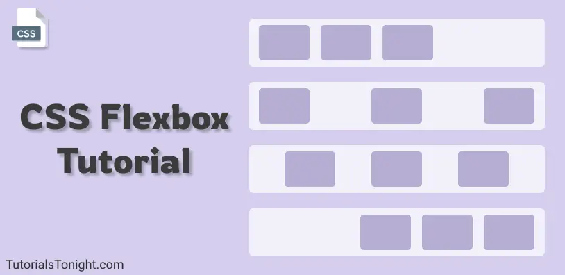
CSS Flexbox Tutorial
Flexbox is a 1-dimensional layout model in CSS. It is a module that comes with lots of CSS properties and can be used to create complex layouts.
- What is CSS flexbox?
- Understanding Flexbox
- How to use flexbox?
- All CSS Flexbox Properties
- Flexbox CSS properties for container itself (Parent)
- Flexbox CSS properties for container's items (Child)
Table Of Contents
What is CSS flexbox?
CSS flexbox is a one-dimensional web layout method that is used to arrange HTML containers in a row or column.
Flexbox or CSS flexbox allows the HTML elements to get automatically arranged depending on screen sizes.
It is a module that comes with lots of CSS properties and can be used to create complex layouts.
The main idea behind CSS flexbox is to give the container ability to change its item's size automatically to best fit in available space.
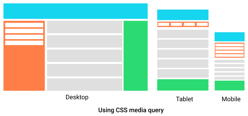
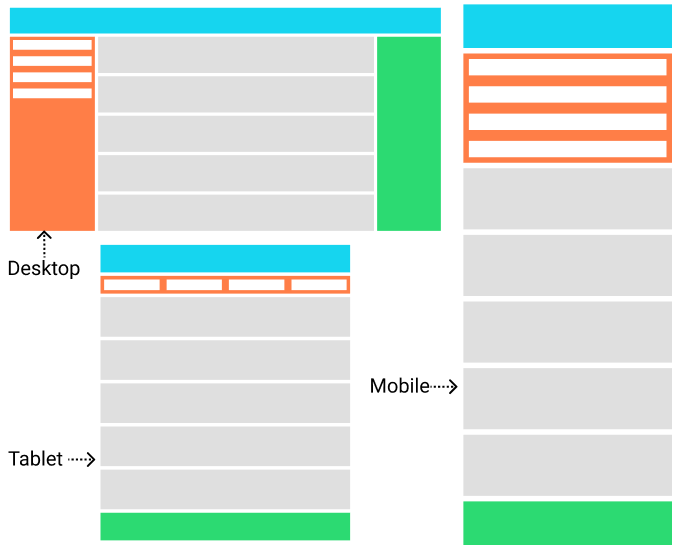
Here are 3 images that show how HTML containers arranged using flexbox automatically fits themselves according to device width.
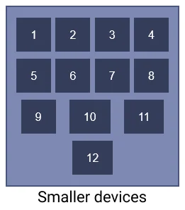
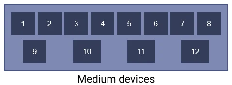
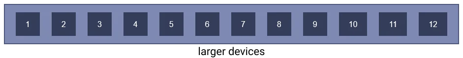
CSS flexbox makes web developers life easy to design and arrange HTML elements in the webpage.
Before CSS flexbox it was quite difficult to fit and align-items on a webpage. The items were mostly laid out using float and position properties. Even though using just float and position properties we were unable to perform many tasks like:
- Aligning items vertically
- Making child element take up equal space even with unequal length of items
Understanding CSS flexbox
CSS flexbox is not a property its a module ( a W3C recommendation as of Oct 2017 ). It involves a whole set of CSS properties, some of its property is for the container itself on which flexbox is applied and some are for its child elements.
To understand flexbox you have to think in terms of 2 axes -
- the main axis: The horizontal axis
- the cross axis: The verticle axis
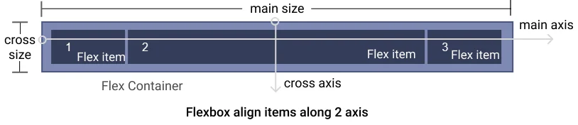
The items of the container will either lie along the main axis or the cross axis and these items can be placed at a various place along this 2 axis.
So now we have an idea, that container will align its item in 2 direction horizontal and verticle and along with these 2 directions, it will be spread in various ways, like align in the start, in the end, in middle, or spread in other ways.
How to use flexbox?
To start with flexbox we first need to define flexbox in our parent element so that other properties of flexbox could be used by the parent as well as a child element.
To make the container a flexible box define display: flex or display: inline-flex to the container:
- display: flex makes the container itself behave like a block element
- display: inline-flex makes container behave like inline element
Example
▶ Try itYou can see in the output above adding display: flex property creates a flex container and by default, its item is aligned in the horizontal direction.
All CSS Flexbox Properties
Since you know now how to create a flexbox in CSS, its time to know all the CSS properties associated with flexbox.
The flexbox properties can be divided into 2 parts:
CSS that is applied on the container itself (Parent) - Flexbox properties which is applied on the container itself are as follows:
CSS that is applied on items of the container (Child) - Flexbox properties which is applied on the items of the container are as follows:
Now let's see each property and what effect it creates with example.
Flexbox CSS that is applied to container itself (Parent)
Let's look at all the flexbox property applied to the flexbox container.
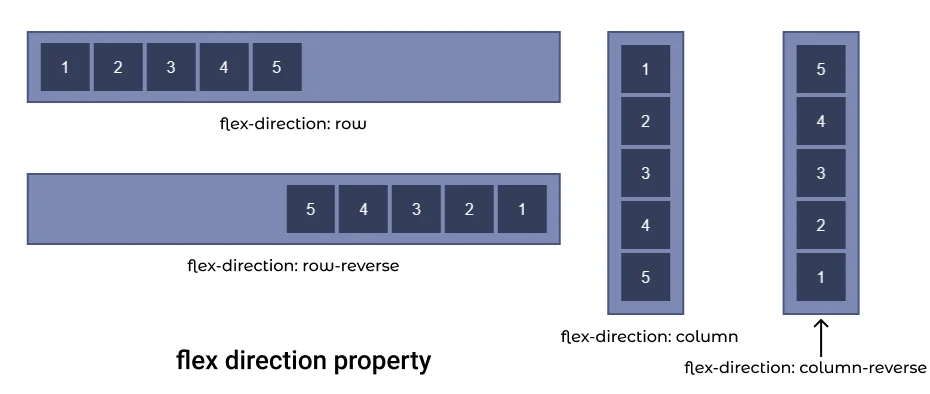
1. CSS flex-direction
Flexbox module provides a property called flex-direction which specify what direction the children are laid out in.
flex-direction has 4 different values:
- row: It aligns flexbox items from left to right. It is the default value of flex-direction.
- row-reverse: It aligns flexbox items from the right end of the container to the left end.
- column: It aligns flexbox items from top to bottom in the flexbox container.
- column-reverse: It aligns flexbox items from bottom to top in the flexbox or container.
Let's see flex-direction property with each value with examples.
I. flex direction row
If you want your container elements to be in a row then use flex-direction: row property. It is also the default value of the flex-direction property, so you do not have to explicitly add it.
Possible mistake: Just applying flex-direction property on any container won't work you have use it on the container with flexbox (display: flex)
Output:
II. flex direction row reverse
To set container item in a row but in reverse direction use flex-direction: row-reverse property.
This property cause container items to start from the end of the container in reverse order.
Output:
III. flex-direction column
The flex-direction: column aligns the flexbox items in columns i.e from top to bottom.
Output:
IV. flex-direction column reverse
The flex-direction: column-reverse aligns the flexbox items in columns in reverse order i.e from bottom to top.
Output:
2. CSS flex-wrap
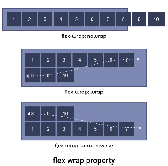
flex-wrap property is used to define whether the flex items are aligned in a single row or the items can flow to multiple rows.
flex-wrap property set values of wrapping items. There are three values that could be set for flex-wrap property nowrap, wrap and wrap-reverse.
- nowrap: It forces flex items to be in the same row. It is the default value for flex-wrap.
- wrap: It let flex items to flow to the next row if there is no space to fit in the same row.
- wrap-reverse: It specifies that flex items can flow to multiple rows but items will start from the bottom of the flexbox and after fill that it will flow to the upper row.
Let's see examples of each property value.
I. flex-wrap nowrap ( default )
The flex-wrap: nowrap property forces container items to stay in the same row. It items do not fit in the container then it is simply overflown.
Output:
II. flex-wrap wrap
The flex-wrap: wrap property let the items to flow to next row if it does not fit in the container.
Output:
III. flex-wrap wrap-reverse
The flex-wrap: wrap-reverse property let the items to flow to the next row but in reverse order, i.e item will start from the bottom of the container and will flow in an upward direction.
Output:
3. flex-flow CSS
The flex-flow property is shorthand for flex-direction and flex-wrap.
Combining both flex-direction and flex-wrap property the flex-flow property defines the cross-axis flow of the container.
The default value of flex-flow is row nowrap.
4. justify-content CSS
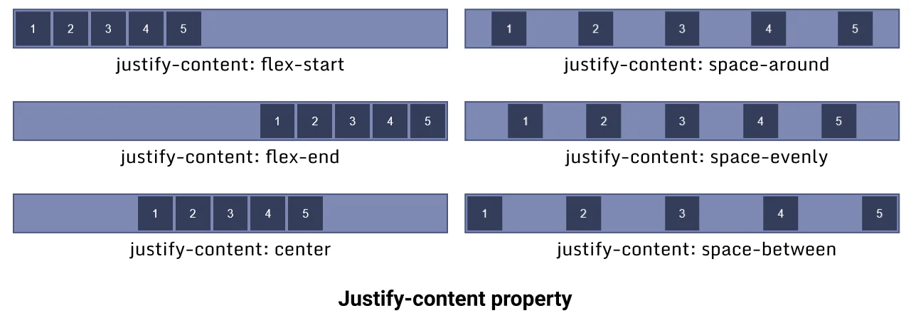
The justify-content property aligns flex items along the X-axis (horizontally) also known as the main axis in the flexbox. All flex line's items align horizontally according to justify-content value.
The justify-content property has 6 different values flex-start, flex-end, center, space-around, space-evenly and space-between.
- flex-start: Aligns items horizontally to the start of the container (default value).
- flex-end: Aligns items horizontally to the end of the container.
- center: Aligns items horizontally to the center of the container.
- space-around: Aligns items horizontally equally distributed.
- space-evenly: Items are so aligned that the space between container and item is the same as the space between items.
- space-between: Aligns items horizontally between the start and end of the container. The first row starts from the left and the last row touches the right.
Let's see examples of each value.
I. justify-content flex-start
This flex-start is the default value of the justify-content property, it aligns container items horizontally to the start of the container.
Output:
II. justify-content flex-end
This flex-end value of the justify-content property aligns container items horizontally to the end of the container.
Output:
III. justify-content center
This center value of justify-content property aligns container items horizontally to the center of the container.
Output:
IV. justify-content space-around
This space-around value of justify-content property aligns container items horizontally to the end of the container.
Output:
Aligns items horizontally and equally distributed.
V. justify-content space-evenly
This space-evenly value of justify-content aligns container items horizontally evenly in the container, the space between the items is equal to the space between items and the container.
Output:
VI. justify-content space-between
This space-between value of justify-content property aligns container items horizontally between the start and endpoint of the container, both end item touches the container ends.
Output:
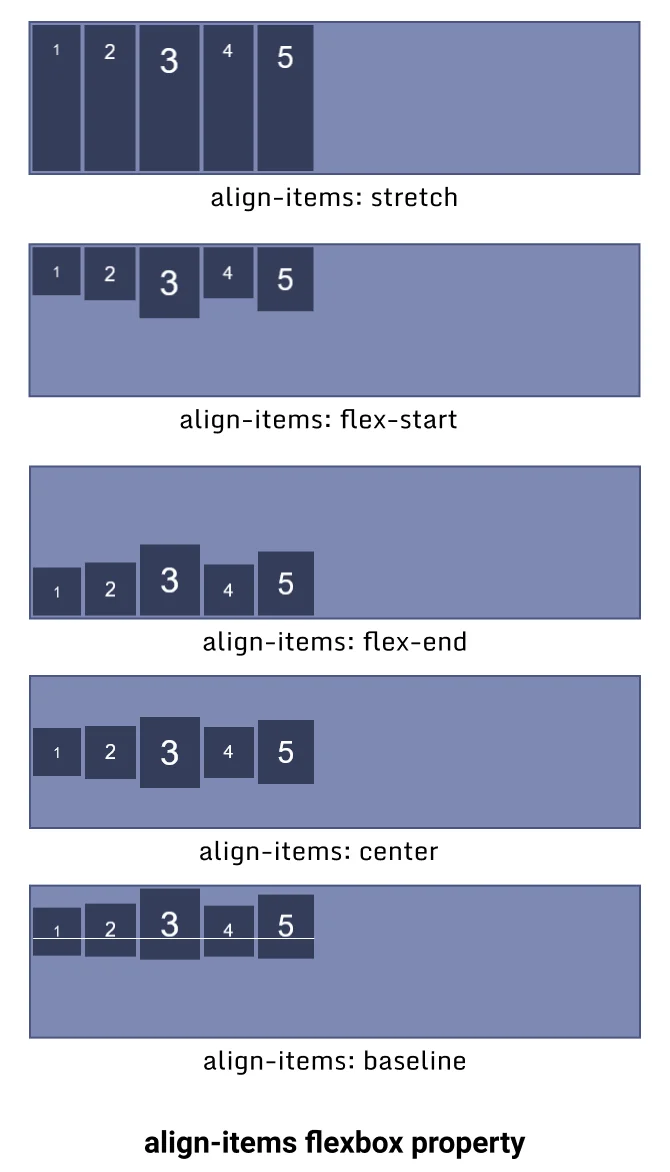
5. align-items CSS
The align-items property aligns the container items along Y-axis (Vertically), also known as a cross-axis in flexbox.
Note: The align-items is a single-line property if your container item wraps to the new line then it won't work for the new line. To align items as a whole use the align-content property.
The align-items property has 5 different values flex-start, flex-end, center, baseline and stretch.
- stretch - It stretches the flex items along the container to fill the container but min-width and max-width are applied to items if mentioned. It is the default value of the
align-itemproperty. - flex-start - It aligns flex items to the top of the container.
- flex-end - It aligns flex items to the bottom of the container.
- center - It aligns flex items in the center of the container.
- baseline - It aligns flex items in such a way that their baseline aligns.
Let's see an example of each value of this property.
I. align-items stretch
The flex-end value align-items property stretches the items along Y-axis and covers 100% height unless the min or max value is defined.
Output:
II. align-items flex-start
The flex-start value align-items property aligns the items to the top of the container.
Output:
III. align-items flex-end
The flex-end value align-items property aligns the items to the bottom of the container. The items start from the bottom of the container.
Output:
IV. align-items center
The center value align-items property aligns the items to the center of the container along the Y-axis.
Output:
V. align-items baseline
The baseline value align-items property aligns the items along their baseline.
Output:
1
2
3
4
5
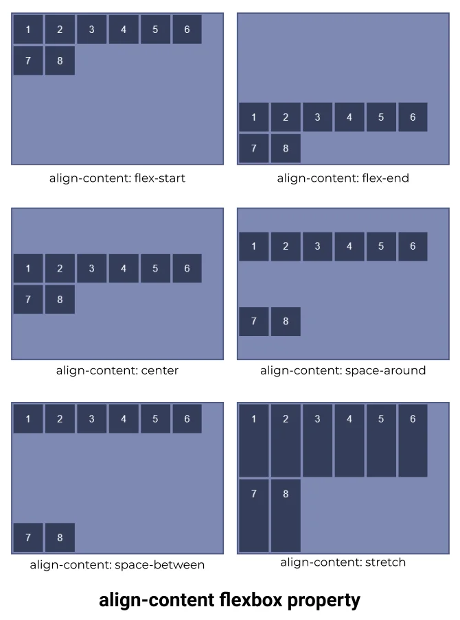
6. align content CSS
The align-content property works the same as the align-content property along Y-axis but the only difference in both is that instead of aligning flex items align-content aligns the flex container's line as a whole
The align-content is multiline property. Its effect is not visible when there is only one row in the flexbox.
The align-content property has 6 different values flex-start, flex-end, center, space-around, space-between and stretch.
- flex-start: Aligns items to the start of the container packed together.
- flex-end: Aligns items to the end of the container packed together.
- center: Aligns items to the center of the container packed together.
- space-around: Aligns items equally distributed along each row packed together.
- space-between: Aligns items packed together between the start and end of the container. The first row starts from the top and the last row touches the bottom.
- stretch: Aligns items packed together and stretched along the cross axis of the container.
Let's see an example for each value of the align-item property.
I. align-content flex-start
flex rows aligned to flex-start which forces flex-items to start from the top together in a group.
Output:
II. align-content flex-end
flex rows aligned to flex-end which forces flex-items to start from the bottom together in a group.
Output:
III. align-content center
flex rows align to the center of the container together in a group.
Output:
IV. align-content space-around
The space-around sets flex lines to align evenly in the container.
Output:
V. align-content space-between
flex rows aligned in space between the container's first row touching the top and the last row touching the bottom.
Output:
VI. align-content stretch
flex rows items are stretched along the cross axis.
Output:
Flexbox CSS that is applied on container's items (Child)
There are 6 different flexbox properties that are applied to the specific item of the flexbox container.
1. Flexbox order
The order CSS property of flexbox defines the order of an item in flexbox. Items of the container are sorted according to their order value in ascending order and then by their source code order.
The default value of the order is 0.
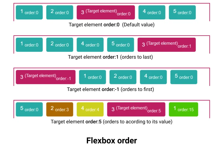
Order accepts only Integers (both positive and negative), decimal values are not allowed
flexbox order example
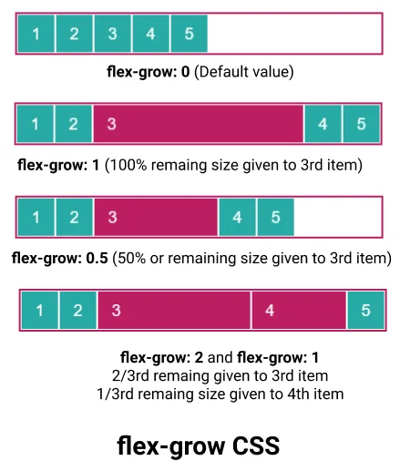
2. flex-grow CSS
The flex-grow CSS property defines a flex grow factor of any specific item's main size, where the main size is either height or width of the container depending on the flex-direction property.
The flex-grow property defines how the remaining space in the container will be assigned to the item, where the remaining space is the size of the container which remains after all items fit in.
The flex-grow value is always positive or 0, the negative value is not supported.
flex grow example
Suppose you have 5 items of equal width 50px in a flex container with a width of 400px, and for simplicity suppose there is no margin between the items.
Remaining size: (400 - 50*5) = 150px
Now, if we set flex-grow: 1 to 3rd item then this 150px will be given to it. And its total width will become 50px + 150px = 200px.
If we set flex-grow: 0.5 to 3rd item then this 75px will be given to it (50%).
If we set flex-grow: 2 to 3rd item and flex-grow: 1 to 4rt item then 2/3 of remaining (100px) will be given to 3rd element and 1/3 of remaining size will be given to 4th element(50px).
3. flex-basis
The flex-basis CSS property is used to set the size of the flex item.
In case both flex-basis and width (or height) are defined for an element then flex-basis has priority.
4. flex-shrink
The flex-shrink CSS property is used to set the flex-shrink factor for a flex item.
It determines how much a flex item will shrink relative to the rest of the items in the container when the container is full.
5. flex
This is a shorthand property for flex-grow, flex-basis and flex-shrink.
6. align-self
The align-self property overwrites the align-items value for individual items. It aligns the item within the container on the Y-axis.
The align-self property has no effect on block-level items.
Points to remember:
- CSS flexbox is a layout model which is used to position items in a container in 2D.
- To start with flexbox you have to define your parent container as a flexbox by using
display: flex | inline-flex. - Flexbox provides 6 different CSS properties for the parent element and 6 different CSS properties flexbox items.
- To practice CSS flexbox in a fun way you can visit flexbox froggy, which provides a game that uses flexbox knowledge to play, you can practice flexbox here by playing the game
CSS Media Queries - Make Responsive Websites
In this tutorial, you will learn about the CSS media query. What is it used for, how you can use it and how to make a responsive website using it.
What is a media query?
Media query is a technique introduced in CSS3 which let users define different CSS styles for different devices and different screen sizes.
It can modify the appearance and even behaviour of your webpage based on certain matched conditions.
It is useful when you want to design a webpage that auto-adjusts according to different devices like Desktop, laptop, pads, tablet, mobile etc.
Media query is mainly used to target a particular viewport range. It uses the @media rule with the condition to define a block of CSS which is applied to element when the condition is true. Here is an example we will discuss in detail later in this section.
Not only viewport width you can target a lot of things like screen resolution, device type, screen orientation, etc.
Media query syntax
Now you have understood what a media query is, let's look at its syntax with examples.
A Media query has 4 different parts:
- At-rule (@media) - Media query starts with the @media ruleset itself.
- Logical operator (not, only, and) - Media query support logical operators like other programming languages like and, not, or (comma) and only.
- Media type (screen, printer, etc) - It defines the type of media we are targeting like print, screen, speech or all.
- Media-feature (width, max-width, height, etc) - Media feature target match features like width, height, aspect-ratio, orientation, etc.
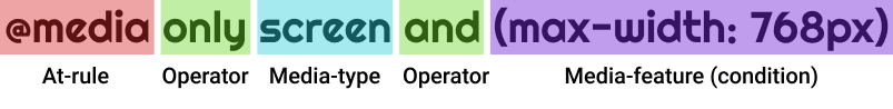
A media query starts with the @media keyword followed by media-type and conditions separated by the logical operation.
Here is a working example, in this example when the screen width gets greater than 768px than the background color of the webpage change to a light green color.
Media Query min width
The min-width media feature is used to set CSS properties for an element which works only when the minimum width of the media type (screen) is greater than the specified width.
In the example below, the background color and color of the webpage change when the screen width is greater than 500px.
Example 1
▶ Try itNote: media queries must be last to define in style because defined styles are taken into consideration from top to down, if any media query is defined for any selector before defining normal CSS for that selector then the media query is ignored.
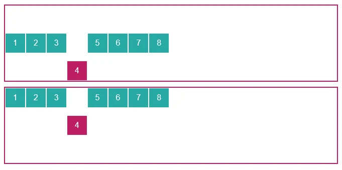
Here is another example where the column width increases to 100% when the viewport width gets smaller than 576px.
Example 2
▶ Try itMedia Query max width
The max-width in the media query is used to set CSS properties which work only when the maximum width of the media type (screen) is smaller than or equal to the specified width.
Note: The operator only is optional operator modern browser don't need it.
Hiding an element on mobile using media query
There are some situations when you want to hide certain elements of a webpage on a mobile device or divide with a specific viewport width.
You can use CSS display property and set it to none below breakpoint for mobile (here 320px is used).
Combining multiple media feature
Media query let you combine multiple media feature (condition) as well as multiple media types separated by logical operators.
Here is an example which target device width with viewport width between 500px to 800px. When device width is between 500px to 800px then background is lightgreen else white.
Inverting a query meaning
The not logical operator inverts the entire meaning of the media query. It will invert only the specified media query it is applied to.
If there are other comma-separated media query then it is not applied to all.
The not is evaluated last in the query.
The above query is evaluated like this:
Not like this:
Here is another example:
The above query is evaluated like as follows:
Not like as follows:
Designing a responsive website using media query
The idea of the responsive website was generated from a media query.
Responsive websites are those websites that adjust elements size, alignment and orientation based on device width.
Let's design a webpage that is responsive to using media queries.
Output:
Using Media Query in HTML
Media queries are not only applied in CSS but can be directly applied in HTML to load resources based on media type and media features.
Loading different external CSS based on viewport size
<link> element used for loading external CSS file to the webpage can use media attribute to load CSS file optionally.
You can see in the above code, you can load different CSS files based on device type or viewport size. It improves the page targeting for the different device as CSS loaded is more specific to the device.
But, this is not always the case when a small device like mobile visits the page then it loads the only file that satisfies the condition of a media query, while when you visit a device with a bigger viewport then it loads all CSS files for a matching device.
Not only in CSS files but you can use it load different <source> in <picture> element.
Using Media Query in JavaScript
You can use media query in JavaScript also. You can create a media condition that targets a specific media type or media feature.
Use window.matchMedia() to define the condition.
Conclusion
Nowadays it is necessary for your website to be responsive. And if you want to make responsive websites then media query is at the core. For responsive websites, the most famous choice is bootstrap framework, even bootstrap use media query at its code for responsiveness.
Points to remember:
- Media query can conditionally apply CSS properties to certain elements of the webpage when the device type of viewport dimension matches.
- It can load different resources only for a targeted device or targeted screen size. like in the <picture> element you can set multiple sources of an image that will load when a certain media condition satisfies.
- It will load an external CSS file that is attached for a media query even when the query is false in <link> element but will not apply its property to the page until the condition is true.
- Using
window.matchMediamedia query can also be used in JavaScript.
Comments
Post a Comment