flex box = https://www.joshwcomeau.com/css/interactive-guide-to-flexbox/
color =https://www.joshwcomeau.com/css/color-formats/
What is viewport height/viewport width in CSS?
Ans. It is a CSS unit that is used for measuring the height and width in percentage w.r.t. the viewport. It is mainly used in responsive design techniques. The measure VH is 1/100 of the height of the viewport. If the height of browser is equal to 1000px, 1vh is 10px. and if the width is 1000px, 1 vw is 10px
Image Sprites
An image sprite is a collection of images put into a single image.
A web page with many images can take a long time to load and generates multiple server requests.
Using image sprites will reduce the number of server requests and save bandwidth.
define gradients in CSS.
CSS gradients let you display smooth transitions between two or more specified colors.
CSS defines three types of gradients:
- Linear Gradients (goes down/up/left/right/diagonally)
- Radial Gradients (defined by their center)
- Conic Gradients (rotated around a center point)
What are the properties of flexbox?
The properties of flexbox are flex-direction, wrap, flow, content, and align-items, and content.
What are the position states in CSS?
The four-position states in CSS are relative, static, absolute, and fixed. The default position state is static.
What is cascading in CSS?
Cascading is defined as the process of style declaration and its weight that will help the browser in selecting the styling rules with respect to time.
What are the limitations of CSS?
- CSS cannot always assure compatibility with every browser; you need to be cautious while choosing the style selector.
- The parent selector tag is not available, thus you can’t select the parent selector tag.
- Some selectors can lead to cross-browser issues due to their less browser-friendly behavior.
- We cannot request a webpage through CSS.
How can you use CSS to control image repetition?
The background-repeat property is used to control the image. Example:
h3 {
background-repeat: none;
}
The background-repeat property in CSS is used to repeat the background image both horizontally and vertically. It also decides whether the background image will be repeated or not.How can you target h3 and h2 with the same styling?
Multiple elements can be targeted by separating with a comma:
h2, h3 {color: red;}
Tell us about the use of the ruleset.
The ruleset is used for the identification of selectors, which can be attached with other selectors. The two parts of a ruleset are:
- Declaration block: contains one or more semicolon-separated declarations
- Sector: indicates the HTML element needed to be styled
What is meant by RGB stream?
RGB represents colors in CSS. The three streams are namely Red, Green, and Blue. The intensity of colors is represented using numbers 0 to 256. This allows CSS to have a spectrum of visible colors.
What is CSS?
CSS stands for Cascading Style Sheet. It’s a style sheet language that determines how the elements/contents in the page are looked/shown. CSS is used to develop a consistent look and feel for all the pages.
Cascading Style Sheets, fondly referred to as CSS, is a simple design language intended to simplify the process of making web pages presentable.
CSS handles the look and feel part of a web page. Using CSS, you can control the color of the text, the style of fonts, the spacing between paragraphs, how columns are sized and laid out, what background images or colors are used, layout designs,variations in display for different devices and screen sizes as well as a variety of other effects.
What is the CSS Box Model?
The CSS box model is a container that contains multiple properties including borders, margin, padding, and the content itself. It is used to create the design and layout of web pages. According to the CSS box model, the web browser supplies each element as a square prism.
- Content: Actual Content of the box where the text or image is placed.
- Padding: Area surrounding the content (Space between the border and content).
- Border: Area surrounding the padding.
- Margin: Area surrounding the border
What are the advantages of using CSS?
- CSS saves time: You can write CSS once and reuse the same sheet on multiple HTML pages.
- Easy Maintenance: To make a global change simply change the style, and all elements in all the webpages will be updated automatically.
- Search Engines: CSS is considered a clean coding technique, which means search engines won’t have to struggle to “read” its content.
- Superior styles to HTML: CSS has a much wider array of attributes than HTML, so you can give a far better look to your HTML page in comparison to HTML attributes.
- Offline Browsing: CSS can store web applications locally with the help of an offline cache. Using of this we can view offline websites

4. How to include CSS in the webpage?
External Style Sheet: An external file linked to your HTML document: Using link tag, we can link the style sheet to the HTML page.
<link rel="stylesheet" type="text/css" href="mystyles.css" />2 - Embed CSS with a style tag: A set of CSS styles included within your HTML page.
<style type="text/css">

/*Add style rules here*/

</style>
Add your CSS rules between the opening and closing style tags and write your CSS exactly the same way as you do in stand-alone stylesheet files.
3 - Add inline styles to HTML elements(CSS rules applied directly within an HTML tag.): Style can be added directly to the HTML element using a style tag.
<h2 style="color:red;background:black">Inline Style</h2>4 - Import a stylesheet file (An external file imported into another CSS file): Another way to add CSS is by using the @import rule. This is to add a new CSS file within CSS itself.
@import "path/to/style.css"What is a CSS selector?
Universal Selector: The universal selector works like a wildcard character, selecting all elements on a page. In the given example, the provided styles will get applied to all the elements on the page.
* {
  color: "green";
  font-size: 20px;
  line-height: 25px;
}
Element Type Selector: This selector matches one or more HTML elements of the same name. In the given example, the provided styles will get applied to all the ul elements on the page.
ul {
  line-style: none;
  border: solid 1px #ccc;
}
ID Selector: This selector matches any HTML element that has an ID attribute with the same value as that of the selector. In the given example, the provided styles will get applied to all the elements having ID as a container on the page.
#container {
  width: 960px;
  margin: 0 auto;
}

<div id="container"></div>
Class Selector: The class selector also matches all elements on the page that have their class attribute set to the same value as the class. In the given example, the provided styles will get applied to all the elements having ID as the box on the page.
.box {
  padding: 10px;
  margin: 10px;
  width: 240px;
}

<div class="box"></div>
Descendant Combinator: The descendant selector or, more accurately, the descendant combinator lets you combine two or more selectors so you can be more specific in your selection method.
#container .box {
	float: left;
	padding-bottom: 15px;
}

<div id="container">
	<div class="box"></div>

	<div class="box-2"></div>
</div>

<div class=”box”></div>
This declaration block will apply to all elements that have a class of box that is inside an element with an ID of the container. It’s worth noting that the
.boxelement doesn’t have to be an immediate child: there could be another element wrapping.box, and the styles would still apply.Child Combinator: A selector that uses the child combinator is similar to a selector that uses a descendant combinator, except it only targets immediate child elements.
#container> .box {
	float: left;
	padding-bottom: 15px;
}

<div id="container">
	<div class="box"></div>

	<div>
		<div class="box"></div>
	</div>
</div>
The selector will match all elements that have a class of
boxand that are immediate children of the#containerelement. That means, unlike the descendant combinator, there can’t be another element wrapping.boxit has to be a direct child element.General Sibling Combinator: A selector that uses a general sibling combinator to match elements based on sibling relationships. The selected elements are beside each other in the HTML.
h2 ~ p {
	margin-bottom: 20px;
}

<h2>Title</h2>
<p>Paragraph example.</p>
<p>Paragraph example.</p>
<p>Paragraph example.</p>
<div class=”box”>
	<p>Paragraph example.</p>
</div>
In this example, all paragraph elements (<p>) will be styled with the specified rules, but only if they are siblings of
<h2>elements. There could be other elements in between the<h2>and<p>, and the styles would still apply.Adjacent Sibling Combinator: A selector that uses the adjacent sibling combinator uses the plus symbol (+), and is almost the same as the general sibling selector. The difference is that the targeted element must be an immediate sibling, not just a general sibling.
p + p {
	text-indent: 1.Sem;
	margin-bottom: 0;
}

<h2>Title</h2>
<p>Paragraph example.</p>
<p>Paragraph example.</p>
<p>Paragraph example.</p>

<div class=”box”>
	<p>Paragraph example.</p>
	<p>Paragraph example.</p>
</div>
The above example will apply the specified styles only to paragraph elements that immediately follow other paragraph elements. This means the first paragraph element on a page would not receive these styles. Also, if another element appeared between two paragraphs, the second paragraph of the two wouldn’t have the styles applied.
Attribute Selector: The attribute selector targets elements based on the presence and/or value of HTML attributes, and is declared using square brackets.
input [type=”text”] {
	background-color: #444;
	width: 200px;
}

<input type="text"
What is VH/VW (viewport height/ viewport width) in CSS?
It’s a CSS unit used to measure the height and width in percentage with respect to the viewport. It is used mainly in responsive design techniques. The measure VH is equal to 1/100 of the height of the viewport. If the height of the browser is 1000px, 1vh is equal to 10px. Similarly, if the width is 1000px, then 1 vw is equal to 10px
Absolute Units
Absolute units are static sizes that are not change according to the device or window sizes.
Relative Units
Relative units are flexible in size that will help websites to resize according to the device. These units measured from parent element or window size.
What is the difference between inline, inline-block, and block?
Block Element: The block elements always start on a new line. They will also take space for an entire row or width. List of block elements are <div>, <p>.
Inline Elements: Inline elements don't start on a new line, they appear on the same line as the content and tags beside them. Some examples of inline elements are <a>, <span> , <strong>, and <img> tags.
Inline Block Elements: Inline-block elements are similar to inline elements, except they can have padding and margins and set height and width values
Pseudo-elements
A CSS pseudo-element is a keyword added to a selector that lets you style a specific part of the selected element(s).
A CSS pseudo-class is a keyword added to a selector that specifies a special state of the selected element(s). For example, the pseudo-class
:hovercan be used to select a button when a user's pointer hovers over the button and this selected button can then be styled.What property is used for changing the font face?
This chapter teaches you how to set fonts of a content, available in an HTML element. You can set following font properties of an element −
The font-family property is used to change the face of a font.
The font-style property is used to make a font italic or oblique.
The font-variant property is used to create a small-caps effect.
The font-weight property is used to increase or decrease how bold or light a font appears.
The font-size property is used to increase or decrease the size of a font.
The font property is used as shorthand to specify a number of other font properties.
<html>
   <head>
   </head>

   <body>
      <p style = "font-family:georgia,garamond,serif;">
         This text is rendered in either georgia, garamond, or the
         default serif font depending on which font  you have at your system.
      </p>
   </body>
</html>
p { font-family: "Times New Roman", Times, serif; }


How is border-box different from content-box?
box-sizing: border-box;
1. content-box:
Default box-sizing property. The width and height properties (and min/max properties) includes only the content. Border and padding are not included
2. border-box:
The width and height properties (and min/max properties) includes content, padding and border.
Note :- when using box-sizing : content-box; the content size remain same while border-box size grows as padding and border grow. but when using box-sizing: border-box; , the size of border-box remains same while size of content decreases as padding and border grow.

How is opacity specified in CSS3?
Why should we use float property in CSS?
What is a z-index, how does it function?
Define z-index.
This is one of the most frequently asked CSS interview questions. Z-index is used to specify the stack order of elements that overlap each other. Its default value is zero and can take both negative and positive values. A higher z-index value is stacked above the lower index element. It takes the following values- auto, number, initial, and inherit.
z-index is used for specifying the vertical stacking of the overlapping elements that occur at the time of its positioning. It specifies the vertical stack order of the elements positioned that helps to define how the display of elements should happen in cases of overlapping.
The default value of this property is 0 and can be either positive or negative. Apart from 0, the values of the z-index can be:
- Auto: The stack order will be set equal to the parent.
- Number: The number can be positive or negative. It defines the stack order.
- Initial: The default value of 0 is set to the property.
- Inherit: The properties are inherited from the parent.
The elements having a lesser value of z-index is stacked lower than the ones with a higher z-index.

1. What do the following CSS selectors mean?
- div, p
- div p
- div ~ p
- div + p
- div > p
The meaning of the given list of selectors goes as follows:
div, p: This selector implies selecting all div elements and all p elements.
Consider an example below:
div p: This selector tells to select all p elements that are inside div elements. Consider an example below:div ~ p: This selector tells to select all p elements that have div elements preceeded anywhere. Consider an example,div + p: This selector says to select all p elements placed immediately after the div element. Consider an example in this case:div > p: This selector says to select all p elements which has div as an immediate parent. In the same example below:What are the different types of CSS?
There are three types of CSS:

3 Types of CSS with Examples
Inline CSS
Inline CSS is generally used to style a specific HTML element only. We can write inline CSS simply by adding the
styleattribute to each HTML element.For Example:
<h1style="background-color:yellow;"> This is a heading </h1><pstyle="color:red"> This is some pragraph </p>This CSS type is not really recommended, as each HTML tag needs to be styled individually. Managing a website may be difficult if we use only inline CSS.
Advantages
- You can easily and quickly write inline CSS to an HTML page.
- It is useful for testing or previewing the changes, and performing quick fixes to your website.
- You don’t need to create or link a separate document as required in the external CSS.
Disadvantages
- Generally, Inline CSS needs to write in each HTML tag individually. So managing a website may be difficult if we use only inline CSS.
- Adding CSS property to every HTML tag is time-consuming.
- Styling multiple elements can affect your page’s size and download time.
Example
<!DOCTYPEhtml><html><body><h1style="color:red">Simple Box Design </h1><divstyle="height:200px;width:300px;background-color:yellow"> </div></body></html>Internal CSS
Internal CSS is also known as embedded CSS. It is generally used to style a single page. We can write internal CSS inside a
<style>tag within the HTML pages.For Example:
<style>h1{background-color : yellow;color : red;}</style><h1> This is a heading </h1>This CSS type is an effective method of styling a single page. However, using this style for multiple pages is time-consuming as you need to put CSS style on every page of your website.
Advantages
- You can use ID and class selectors to write the internal CSS.
- Since you’ll only add the code within the same HTML file, you don’t need to create or upload multiple files.
Disadvantages
- Since you’ll only add the code within the same HTML file, styling multiple pages will become time-consuming.
- Adding the code to the HTML document can increase the page’s size and loading time.
Example
<!DOCTYPEhtml><html><head><style>/* Using tag name as a selector here */h1{background-color:orange;}/* Using class as a selector here */.box{height:200px;width:300px;background-color:yellow;}/* Using ID as a selector here */#circle{height:200px;width:200px;background-color:red;border-radius:50%;}</style></head><body><h1>Simple example of internal CSS</h1><divclass="box"></div><divid="circle"></div></body></html>External CSS
With an external CSS, you can change the look of an entire website by changing just one file. We can write external CSS in a separate .css file. Each HTML page must include a reference to the external CSS file inside the
<link>tag, inside the<head>tag.For Example:
creating a my-style.css file with any text editor( eg:- Notepad++)
/* Using tag name as a selector here */h1{background-color:orange;}/* Using class as a selector here */.box{height:200px;width:300px;background-color:yellow;}/* Using ID as a selector here */#circle{height:200px;width:200px;background-color:red;border-radius:50%;}Now include the my-style.css external file in your HTML page using
<link>tag:<linkrel="stylesheet"type="text/css"href="my-style.css"/>The complete HTML page will look like this:
1234567891011<!DOCTYPEhtml><html><head><linkrel="stylesheet"type="text/css"href="my-style.css"/></head><body><h1>Simple example of external CSS</h1><divclass="box"></div><divid="circle"></div></body></html>Advantages
- Since the CSS code is in a separate file, your HTML files will have a cleaner structure and be smaller in size.
- You can use the same .css file for multiple pages when you want the same look for each page.
Disadvantages
- Your pages may not be rendered correctly until the external CSS is loaded.
- Uploading multiple external CSS files can increase the download time of a website.
Difference between the 3 types of CSS styles
The below table shows you the difference between inline or embedded and external CSS. Internal CSS is also known as embedded CSS.
Inline CSS Internal CSS External CSS Inline CSS is used to style a specific HTML element. Internal CSS is used to style a specific HTML page. External CSS is used to change the look of an entire website by changing just one file. You can write inline CSS using the style attribute. You can write Internal CSS using the <style> tag. You can write External CSS in a .css file. It doesn’t allow you to use any selectors. It allows you to use selectors.
eg:- id, class, tag name, etc.It also allows you to use selectors. It takes time to use as each element need to add. It is also time-consuming but in comparison to Inline CSS is less. It saves time as you can use the same file on multiple pages for the same look. CSS Specificity
CSS specificity is also known as CSS priority. An HTML element can be targeted by multiple CSS rules. If the same CSS property is defined multiple times with different-different values then the browser will apply one value based on priority. This is what CSS priority is about.
For better understanding, let’s take an example here,
<pid="first-paragraph"class="paragraph"> This is a sample paragraph </p>Now let’s define multiple CSS rules for it:
1.) Defining CSS rule using the ID selector
#first-paragraph{color :red;}2.) Defining CSS rule using the Class selector
.paragraph{color :blue;}3.) Defining CSS rule using Tag name selector
p{color :green;}Because the browser can apply only one color to this paragraph, it will have to decide which CSS rule takes priority over other ones.
In the above example, the browser will apply the color red because
#idselector has more priority than others.How does CSS Priority work?
The browser takes priority to apply CSS rules based on CSS type and selector. Let’s understand one by one in detail:
Priority based on CSS type
The browser will decide the priority based on three types of CSS (inline, internal, and external). The below image shows the priority among these three types:

Let’s take an HTML element heading
<h1>for example:<h1> This is a sample Heading </h1>Let’s define CSS rules of all three types (Inline, Internal, and External) and see the output:
First create a .css document file (eg: my-style.css) and write the below CSS rules:
/* defining external css rules */h1{background-color:yellow;}Example (Defined all three types)
<!DOCTYPEhtml><html><head><!-- Externally defined CSS rules adding to the HTML page --><linkrel="stylesheet"type="text/css"href="my-style.css"/><style>/* Defining Internal CSS */h1{background-color:blue;}</style></head><body><!-- Defining Inline CSS --><h1style="background-color:green"> This is a sample Heading </h1></body><html>Output
This is a sample Heading
In the above example, Inline CSS has more priority than others that’s why here background color green has been applied by the browser.
Priority based on CSS selector
The browser will also decide the priority based on CSS selectors (eg: #id, .class, and Tag name). The below image shows the priority among the selectors:

Let’s take an HTML element heading
<h1>withidandclassattribute for example:<h1id="my-heading"class="title"> This is a sample Heading </h1>Example (Defined all selectors)
<!DOCTYPEhtml><html><head><style>/* Defining CSS rule using id selector */#my-heading{color : red;}/* Defining CSS rule using class selector */.title{color : blue;}/* Defining CSS rule using tag name selector */h1{color : green;}</style></head><body><h1id="my-heading"class="title"> This is a sample Heading </h1></body><html>Output
This is a sample Heading
In the above example, the #id selector has more priority than others that’s why here red color has been applied by the browser.
Conclusion
Understanding the different types of CSS and their appropriate use is essential for efficient and maintainable web development. Inline CSS is useful for quick and temporary styling, while Internal CSS strikes a balance between specificity and modularity. However, for larger projects with multiple pages, External CSS is the most recommended approach, as it promotes code reusability and consistent styling.
Learn more about CSS Priority here: CSS Priority.
FAQs
What are the 3 types of CSS?
There are three types of CSS inline, internal, and external CSS.
What are the 3 ways to style in CSS?
There are 3 distinct methods for styling in CSS, Local style, Page-Level style, and External Style. Each level of styling is given a different hierarchical priority and is used for different reasons.
What is CSS Flexbox?
- CSS Flexbox is a CSS layout module that is used to arrange and organize items on web pages in one direction, i.e., horizontally and vertically.
- CSS Flexbox helps in creating flexible and responsive layouts where we can adjust the flex items within the flex container.
- It is used to fill the extra space available or shrink the size of the content if it is overflowing.
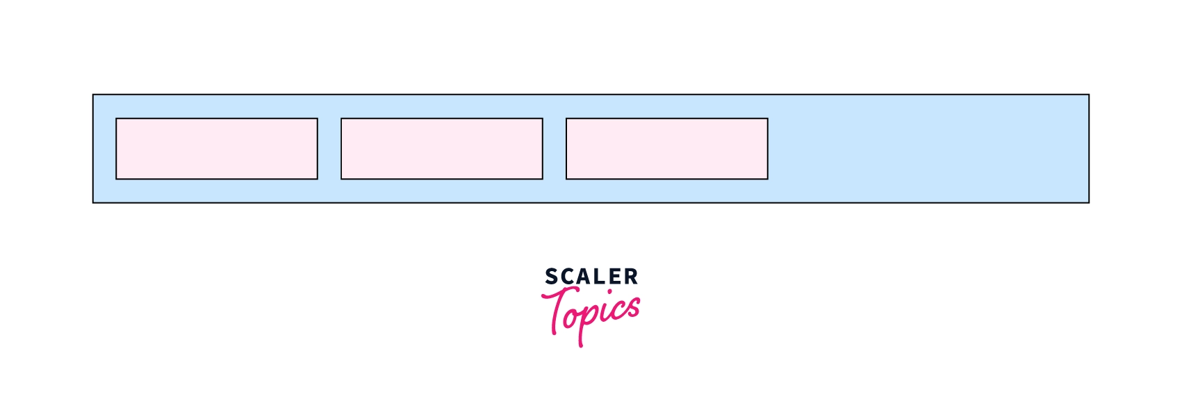 As we can see in the image above, we can arrange flex items using the display property as flex as shown in the syntax.
Syntax:
.flex-container{
    display: flex;
}
Here, in the syntax flex container, the class of the div element and display property as flex will distribute the items from left to right by default.
Flexbox properties
Flex is the value of css display . By using display flex in parent element, child elements automatically align like column or row with auto width and auto height.
ustify Content
justify-content property is used to justify content in main axis. This can adjust items to left, center, right or add space in between.
justify-content values
- flex-start (default)
- flex-end
- center
- space-between
- space-around
- space-evenly
Change justify-content
Item 1Item 2Item 3<style> *{ margin:0; box-sizing:border-box} .flex-container{ display:flex; flex-flow:row wrap; justify-content: flex-start; } .flex-item{ padding:0 10px; border: 1px solid #ccc; margin: 5px } </style> <div class="flex-container"> <div class="flex-item">Item 1</div> <div class="flex-item">Item 2</div> <div class="flex-item">Item 3</div> </div>Align Items
Align-items property define the behavior of how flex item laid out across horizontal axis. By-default, the value is stretch.
Values of align-items
- stretch
- flex-start
- flex-end
- center
- baseline
123<style> *{ margin:0; box-sizing:border-box} .flex-container{ display:flex; flex-flow:row wrap; align-items: stretch; } .flex-item{ padding:0 10px; border: 1px solid #ccc; margin: 5px; } </style> <div class="flex-container"> <div class="flex-item"> 1 </div> <div class="flex-item"> 2 </div> <div class="flex-item"> 3 </div> </div>
Difference between display:none and visiblity: hidden
visibility:hidden hides the element, but it still takes up space in the layout.
display:none removes the element from the document. It does not take up any space.
display:noneturns off the layout of the elements, so they are not renderedvisibility:hiddenhides the elements without changing their layoutsopacity:0causes the elements to be very transparent but users can still interact with them.- css Specificity ?
When more than one set of CSS rules applies to the same element, the browser will have to decide which specific set will be applied to the element. The rules the browser follows are collectively called Specificity
Specificity Rules include:
- Inline CSS: It has the highest specificity and will override all other selectors, including external stylesheets and internal CSS.
- Internal CSS: Internal stylesheets (defined within the
<style>tags in the HTML document) have a higher specificity than external stylesheets. Therefore, internal CSS will override rules defined in an external stylesheet. - External CSS: Styles defined in an external stylesheet (linked via the
<link>tag in the HTML document) have the lowest specificity. If there are conflicting rules between external stylesheets and internal or inline styles, the internal or inline styles will take precedence. Specificity Hierarchy :Every element selector has a position in the Hierarchy.
- Inline style: Inline style has highest priority.
- Identifiers(ID): ID have the second highest priority.
- Classes, pseudo-classes and attributes: Classes, pseudo-classes and attributes are come next.
- Elements and pseudo-elements: Elements and pseudo-elements have lowest priority.
What is a CSS preprocessor?
CSS preprocessors are scripting languages that extend the default capabilities of CSS. They enable us to use logic in our CSS code, such as variables, nesting, inheritance, mixins, functions, and mathematical operations. CSS preprocessors make it easy to automate repetitive tasks, reduce the number of errors and code bloat, create reusable code snippets, and ensure backward compatibility.
Each CSS preprocessor has its own syntax that they compile into regular CSS so that browsers can render it on the client side.
CSS preprocessors do similar things but in more or less different ways, and each has its own syntax and ecosystem (tools, frameworks, libraries) too.
- Inline style: Inline style has highest priority.
Sass: “Syntactically Awesome Style Sheets”
- ////////////////////////////////////////////////////////
Understanding the cascade algorithm helps you understand how the browser resolves conflicts like this. The cascade algorithm is split into 4 distinct stages.
- Position and order of appearance: the order of which your CSS rules appear
- Specificity: an algorithm which determines which CSS selector has the strongest match
- Origin: the order of when CSS appears and where it comes from, whether that is a browser style, CSS from a browser extension, or your authored CSS
- Importance: some CSS rules are weighted more heavily than others, especially with the
!importantrule type
Comments
Post a Comment